How to Persuade Your Audience With Data Storytelling (+Examples)
When you’re trying to influence your audience—whether it’s your company’s executives, a prospective decision-maker, or a group of consumers—one of the most powerful tools in your arsenal is data.
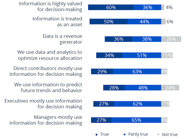
There are numerous studies that show how executives and managers use data in their decision-making processes:
However, since you’re immersed in your industry, it can be easy to assume that individuals outside of your role will understand the numbers as much as you do.
This is where data storytelling comes in. By using visuals to convert those numbers into a compelling story, you can transform otherwise boring or confusing statistics into clearly understood concepts. And when your audience truly understands what you’re communicating to them, they are much more likely to take the action you desire.
In this post, we’ll share:
- What data storytelling is and why you need it.
- How to develop a strategy for persuasive data storytelling.
- Plenty of examples of data visualizations that tell a story.
What is data storytelling?
Data-driven storytelling is the process of transforming a data-based analysis into easily accessible visual forms that influence the business decisions of your target audience. You need to use the right analytical facts that intrigue your potential customers enough that they want to take immediate action on your offerings.
How well you do data storytelling depends on the stories, subjects, visuals, and creativity that you use. When you use cutting-edge tools and technologies to stitch together different metrics and reveal the relationships between them, you are virtually building an entire world of narratives.
What you’ll need to do is pick one or two narratives, find the data that supports it, and build a plot that presents complicated concepts in a form that a person now well-versed in the subject matter can understand.
Why you need data storytelling
Data storytelling is more than just an interesting way to share your data, analytics, and complex information. It has many benefits for your business.
1. Hold the attention of your audience
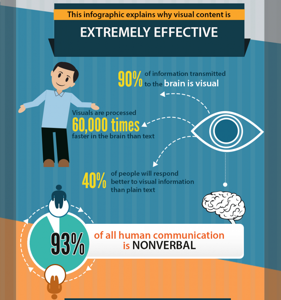
People prefer visuals. Over 90% of the information stored in our brain is in the form of visuals. Combining creative content with associated visuals increases engagement as compared to blogs, articles, and whitepapers that use only text. Using data visualization and visual analytic tools will help you create interactive and visually-appealing presentations that offer actionable insights. This, in turn, can help drive conversions.
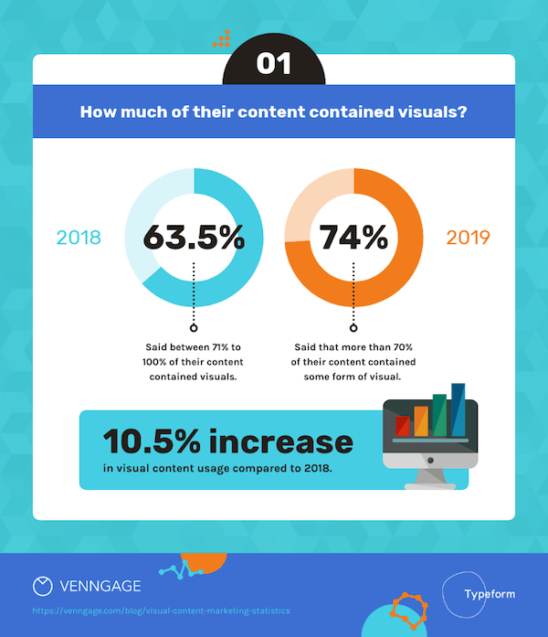
It’s interesting to see how audience preferences have changed when it comes to the way they prefer to produce and consume content. In 2018, just over 60% of companies used visuals in more than 70% of their content. This number jumped to 74% in 2019.
This over 10% increase doesn’t just tell us that audiences prefer visual content to purely written content. It also tells us that more companies are discovering the potential of data storytelling as a marketing tool.
2. Get key points across quickly
Through data storytelling, you can present complex topics in a way that doesn’t require much technical knowledge. Using advanced tools and techniques, you can evaluate, track, and gather relevant information, find data trends and patterns, then visualize them as part of a narrative to help justify business decisions.
With regard to consumer audiences, visualizing key data that supports the need for your product or service can help in your demand generation effors.
The beauty of data storytelling is that it’s easier to process visual content compared to numbers.
For example, when you create a list of the tallest buildings in the world, the height difference between the Burj Khalifa (828 meters) and New York’s One World Trade Center (541 meters) doesn’t exactly jump out of the page. Buch chances are you’ve already skipped past this text to the visual.
Because when you put the two buildings in an infographic, the difference becomes easier to spot:

Using data storytelling as part of your content strategy will help get your point across to people who would otherwise not be able to process it using raw numbers.
3. Make better decisions (and influence those of others)
Because it’s easier for humans to process visuals, data visualization can help us make decisions faster and with more accuracy.
Let’s say you’re calculating how much return on investment (ROI) you’ll get out of two brands of equipment that you’re looking to purchase. Option A promises a higher ROI from Year 1 to Year 4, while Option B offers a higher ROI by Year 5. Which one would you choose?

If you’re just looking at a table, I can’t blame you if you choose Option A since the ROI per year seems higher on average. But when you create a graph based on the data, you’ll see that Option B is the better option because the cumulative cash flow is higher by Year 5.
It’s a lot easier to make decisions when you can actually see and read about their differences than when you’re just staring at a spreadsheet. Data storytelling will allow your audience to see key differences right away.
4. Better manage your data
Machines nowadays gather data from so many different sources at high speeds. In a typical industrial process, there are hundreds, even thousands, of data points that you could track to determine whether the process is producing the results you need.
However, with the amount of data you gather on a daily basis, you’ll soon find right away that it gets hard to manage it effectively. When you’re not able to manage your data, you can’t use it for further optimizations or include it in your presentations. Data storytelling will allow you to analyze data, present it in a way that speeds up the management process, and save your organization time and money.
5. Data motivates people to take action
One basic principle shared by creatives is that there is always more than one side to a story. When you customize your data storytelling to suit your target audience, it makes your data more relatable and impactful.
A good data story provides your audience with insights that convince them to take action.
For example, when you introduce a new product to the market, you’ll usually have three forms of presentation:
- First, you’ll be presenting to your company investors who have a stake in your product’s success or failure.
This is to get your stakeholders to invest in your new product, whether it’s in terms of funding research and development or help with promoting it. In this case, your data story should focus on the bottom line. Using marketing data, you’ll be able to detect trends and predict how many units you think you’ll sell, how much the product will earn you, and how long it will take before your stakeholders can recover their investment.
For a business selling solar products, this visualization is much more compelling than simply stating percentages.
- Second, you’ll need to announce your product’s features to your existing customers to help convince them to upgrade. A good data storyteller will emphasize the new product’s advantages over the old one.
- Third, you’ll announce it to a wider audience who might not be aware of you or your products. Here, you need to persuade potential customers that they need your product and that your product is better than anything the competition can offer. Your data storytelling strategy here should focus on the customer’s pain points, how your product can solve them, and why it offers good value.

In each case, there is an actionable insight that leads to the desired outcome—so long as you choose the data that is best suited for that particular audience.
How to create the right data storytelling strategy
Data storytelling has the power to influence the decisions of your target audience. To strike the perfect balance between data and creative writing, you need to implement a strategy.
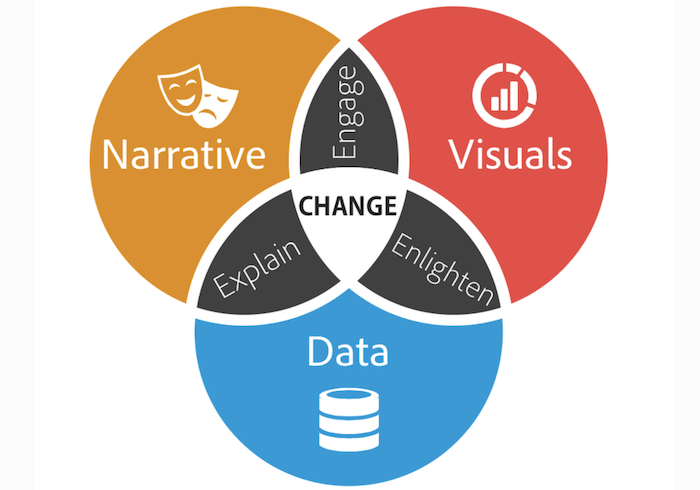
The diagram above shows us the relationships between data, narratives, and visuals in marketing. A narrative helps explain data, visuals help engage content consumers, and data provides the insight to convince the customer to do something. When all three elements come together in perfect balance, they help bring about change in the form of sales, project or process buy-in, or conversions.
Here are some ways you can strike a balance between narratives, visuals, and data through effective data storytelling.
1. Craft a plotline with a clear objective
As we’ve discussed earlier in this article, a good data story has a clear, specific objective. This objective will help you determine the approach you’ll take and the perspective you’ll use.
Once you’ve decided on the approach and perspective, it’s time to craft a plotline. The plot should include an introduction (such as a customer pain point), a body (this is where you describe your product or service and how it stacks up against the competition), and a conclusion (the ultimate benefits of using your product).
Just like starting an online business where every move you make should be weighed and calculated, everything you do as you define your data story plotline should be aligned with your narrative. If a visual element or written sentence doesn’t seem to fit, find or create another one that will take your story forward.
2. Create a compelling narrative
No matter how creatively you package your data, it shouldn’t turn off your audience or bore them! You do data storytelling to capture your potential customers’ attention, and this involves creating a storyline or narrative. Just like the best stories have exciting plots, your data story should be catchy, compelling, and engaging.
If you’re at a loss as to how to present your data story, you may take a cue from the old “Choose Your Own Adventure” books you grew up with. That’s right—you can let your audience choose the story they see! By using Exploratory Data Analysis (EDA) and interactive visualization, you can keep your audiences involved in your content.
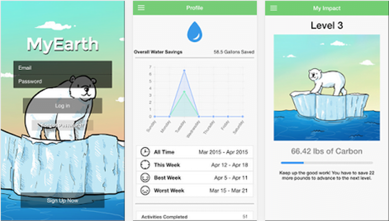
For example, the MyEarth app, available on Google Play, lets you track your daily carbon footprint. Aside from letting you track your water consumption or recycling, the app lets you save a virtual polar bear trapped on a floating chunk of ice. As you reduce your carbon dioxide production, the iceberg grows larger and you save the polar bear from drowning in the open sea.
3. Let the data tell the story
While you want your data story to be engaging and compelling, you also have to be objective. There are many documented cases of businesses manipulating data to fit their desired narratives. While the numbers in these studies were left untouched, the way they were presented led audiences to false conclusions.
One infamous case of data manipulation involved the number of COVID-19 cases in the U.S. state of Georgia. An article in Atlanta magazine recounted how the official state COVID dashboard showed data in non-chronological order as if to lead users to believe that the infection trend was going down:
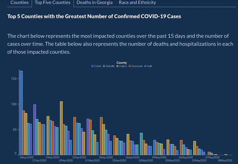
By reversing the order of the dates, this chart communicated the misleading message that COVID-19 cases were decreasing.
The error above was just one of many mistakes that the dashboard’s users discovered. There was an overall sentiment that the data was not being handled carefully enough. Many users even believed that there was an attempt to make the data fit a narrative that was far from what was actually going on.
How can you avoid committing the same errors?
- Let the data dictate the narrative: While many organizations have “massaged” data to fit their storylines, your potential customers will not look at you favorably when you get caught doing the same thing. Instead, your story should be as close as possible to the truth.
- Make your graphics match your data: Graphical representations of data should match their sources. For instance, when your infographic uses circles of different sizes to represent the number of sales per region, larger circles should represent areas with higher sales and smaller circles should represent places with lower sales.
- Implement standardized units: This is particularly important when you’re doing comparisons. When you’re measuring a fever, you either use Fahrenheit or Celsius, not a mix of the two. 32°F is not the same as 32°C!
When you do data visualization and storytelling, your credibility is at stake. Maintaining your objectivity and sticking to the facts will help you maintain your brand’s credibility.
4. Segment your audience by level of understanding of the topic
A good data story will only be effective if it is crafted in a language or form that its audience will understand. This means you may need to segment audiences based on their knowledge of the subject.
- Beginner: Possesses a basic understanding of the subject but does not need further explanation.
- Generalist: Knowledgeable on the subject but want an overall understanding and prime themes.
- Manager: Has deep and practical knowledge of complexities and correlation with access to data.
- Executive: Understands only the importance and outcomes of probable situations.
- Expert: Can do with less data representation and more numbers as they can generate their own conclusions using the data.
You can’t please everyone with just one story. When you’re dealing with data stories, you have to be prepared to create more than one story or use more than one data set to reach all your potential audiences.
5. Choose the right visual representation
Images have long been played a key role in content marketing campaigns. Now, with the increased popularity of infographics, you have another option for telling a story that sticks.
The infographic below will show you why visual content is so effective in conveying information:

As a data storyteller, you have many options to choose from. Here are the different kinds of visualizations you can use to advance your storyline:
Infographics
When facts and figures fail to deliver what you exactly want to say, pictures come into the scene! You can display precise information with an illustrative pictorial representation.
Bar charts
If you want to show a comparison between two figures over a certain timespan, bar charts can be a great choice. They are clear forms of graphical illustration that help viewers to perceive relative value.
Pie charts
Pie charts are an ideal choice to represent different fragments of the whole usually in a circular graph. They need not be perfectly circular. In fact, you can use different shapes. What matters is that all your category data points add up to a recognizable figure.
Line charts
Use line charts to show changes in a timespan as a series of points linked by linear segments on two axes. They help in determining the correlation between 2 sets of values where one of them is always dependent on another.
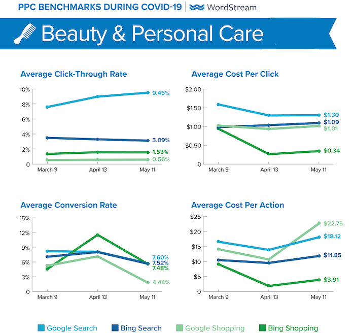
Some line graph visuals from our COVID-19 benchmarks post.
Tables
You may need to display your data in a tabulated format. The audience finds it quite boring to interpret large tables and worksheets. Using bright colors, various layouts, and proper formatting will help you highlight crucial information.
Choropleth and heat maps
Choropleth and heat maps are a kind of thematic map with patterned or colored areas in proportion to statistical variables. For example, a population map will use darker colors to indicate higher population densities.
6. Test and edit the final product
To tell an enriching and impeccable data story to your target audience, you need to test and edit it, ideally in front of someone who represents the audience you’ll be showing it to. I normally use two tests to gauge possible audience response:
- The truth test: Does the story tell the truth? Is it relevant to the audience? Am I letting the data speak for itself, or am I just using it to advance a narrative?
- The readability test: Can my audience understand the data story? Are there any elements in the story that get confusing? Is the story presented clearly, or are there ambiguities that tend to drive me to a different conclusion?
Remember, visually appealing data storytelling does not work if it fails to spell out or add color to your content.
Use data storytelling to achieve your goals
Whether you’re writing for end-users, casual readers, CEOs, or tech evangelists, good data storytelling transforms otherwise confusing or boring data into compelling visuals that get remembered, influence decisions, and spur action.
Data storytelling should always begin with respect—both for the data and for your readers. Let the data drive your narrative, and use the visuals to empower your audience to make informed decisions.
About the author
Jimmy Rodriguez is the COO of Shift4Shop, a completely free, enterprise-grade ecommerce solution. He’s dedicated to helping internet retailers succeed online by developing digital marketing strategies and optimized shopping experiences that drive conversions and improve business performance.


Meet The Author
Guest Author
WordStream’s guest authors are experts, entrepreneurs, and passionate writers in the online marketing community who bring diverse perspectives to our blog on a wide range of topics.
Recommended for you


Comments
Please read our Comment Policy before commenting.